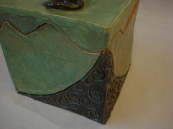
This project was an exciting challenge to tackle; I learned a lot by constructing it. I encountered problems with the sides being too thin, caving in, and having to switch from white to red clay half way through because the white clay ran out. However, I think I pushed through these challenges and produced a successful box. Despite the crack along one of the edges, I think my craftsmanship was up to par, and I spent sufficient time glazing and planning.
If I were to redo this project, I would have spent more time in assuring the edges were straight and better assembled. I also wish I had spent more time in making a more functional handle. I was rushed on the last day to finish my box so I rushed through constructing the handle.
Overall I am pleased with my box and am proud of what I did.
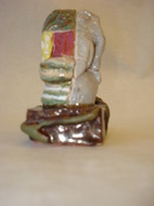
Although I prefer sculpting functional ceramic pieces, this was enjoyable to make. It is in no way my best piece, however. The concept outweighs the finished product, because the lines are crooked and muddy appearing. My idea behind this kiln god was emphasizing the juxtaposition of nature and society; the left side has outrageous colors and patterns while the right tries to mimic realism. I don't think I got my message across as well as I could have. If I could go back and re-do this project, I would have tried to get the proportions correct for the elephant's face, been more careful glazing, and made the box more symmetrical. This project challenged me to think creatively more than the mugs or vessels, for example, because of the openness. I like that you did not have to stick to your original idea made in the sketchbook, and that you were able to use new ideas that you gain in the process.
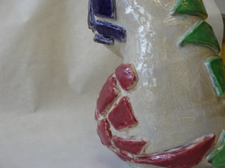
I am pleased with the outcome of my vessel; I feel it stays true to my style. Although the construction of this ended up being tilted at an angle, instead of straight, I think I followed my stencil to the best of my ability. The color choice is not the best especially for the shapes. More contrasting colors like black and dark blue would have added more emphasis. The pink color turned out somewhat blurry, and not how I desired the color to turn out. I think this is because it was an older, clumpier glaze. In the future I will be sure to make sure the glazes are still in good condition. Overall, I enjoy this vessel and the project in general. It would have been fun to have a little more freedom to change your ideas after the stencil, but I understand the necessity to grade us on replicating something.
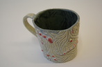
While creating my mug, I learned that a functional piece of art can also be artistic. My mug acts as both a piece of art, and a cup that I can drink out of. Throughout the course of this project I learned that creating a deeper incision looks more appealing than a minimal low relief incision. A random technical breakthrough I experienced while glazing was that the glaze runs when more than one glaze is used on the same area. I could use this technique idea in the future to create a really interesting glaze on a simple piece. I want to try and recreate a similar pattern that I used on my mug in our future projects. I hope to combine more high and low relief, however. I plan on possibly using geometric shapes, and harsher lines instead of flowing lines.
Trying to keep the rim of the mug straight and stay the same width on each side proved to be a struggle for me. Having the plastic cup helped maintain the shape of the mug throughout the building of the mug. I found it easiest to hold the mug from the inside, because I was putting so much pressure on the mug while carving out my design. In some areas I carved in too deep, so from the inside of the mug you can see a faint outline of the design that I carved. It frustrates me that you can see the design, but with the dark glaze I used on the inside it is concealed pretty well so that it is not too obvious. I don’t believe that anything in this project should have been altered. Making a mug is not a hard task, and the project guidelines should be kept the same in the future!
I could have improved the consistency of width of my mug. Throughout the process of designing my mug I must have put too much pressure in some areas so that it became extremely thin. To improve this in the future I will work on being gentler and being more aware of the thickness of the clay. So the area of the rubric that I need to focus on is craftsmanship. I feel like time and effort I put into this mug was my strength; also I feel that I challenged myself more than the tile project.
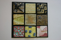
Throughout the process of creating my tiles, I learned the basics techniques of how clay works through experimentation of textures, tools, and trial/error. I learned techniques such as layering, high and low relief, incision, and how to simply roll out a slab of clay evenly and cleanly. For this specific project, I didn't have any artistic concept to base on my tiles, only because I was experimenting new techniques that I can later apply to my works. I wouldn't say I experienced a “breakthrough,” but I definitely had a learning experience. I applied the technique of adding and subtracting geometric shapes from my artwork in my other class that I have been using for about a year. Scratching off the glaze to leave sections bare when firing for the second time, l discovered, acts like crayon and watercolor, leaving it white. I plan on continuing combining similar colored glazes to create a marble like finish. Also, I learned that the brighter colored glazes have a far less sophisticated look to them, so I want to continue to use cooler colors.
My struggles included using too much glaze and it filling in my incisions, my compositions not working well, and having my tiles warp/bend in the kiln. After firing, there was not much to do but accept that some tiles were not my best work. But, I did learn how to not repeat my mistakes for the future. Overall, the glazes frustrated me more than creating my tiles. Specifically the colors not being as vibrant as I had wished; they were dull in some areas and too bright in others. This project could have been improved by narrowing it down to six tiles, so we would be focused on quality not quantity. However, this being our first project, it was necessary to experiment with many tiles to learn necessary techniques.
The craftsmanship could have been improved, especially the symmetry of the tiles. Some are larger, thicker, or more warped than others. I feel that if I was more consistent and took more time in building the tiles, that would reflect as more time and effort was put into the project. I will try and focus on the challenge and effort area on the rubric in the future. Planning and challenging myself will definitely make my work appear better. Thinking back, I wish I had chosen more coherent colors as a group, because when all tiles are displayed on the board, the colors do not appear unified which takes away from each individual tile.
 RSS Feed